Behind the Process of Website Design
To the untrained eye, a well-designed website is just a pretty face. As a web designer, I can tell you first hand that high-quality web design is about a lot more than appearances. There’s quite a bit of depth behind all those good looks.
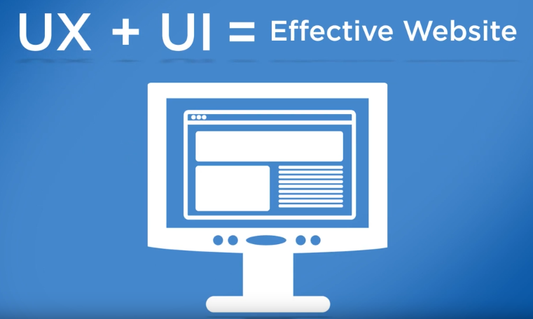
Maybe you’ve heard of user experience (UX) and user interface (UI). These are the design principles behind every website we create. Both are crucial to creating a product that helps our client accomplish their goals while creating a positive experience for website visitors. UI describes how a website looks and functions. It’s the architecture and design that makes the site tick. UX describes how users feel when they use the site. If you want to learn more on the subject, check out our recent Digital Happy Hour on the subject.
As marketers, Strategic America has to deliver a product that helps our clients meet their business objectives. My goal as the web designer is to create the best UI possible, so the UX can thrive. This requires a lot of heavy lifting in the planning phase. Before I start thinking about which fonts will really express our client’s brand, I need to work on an internal structure that promotes the website’s main purpose.
Using Research to Get Started
The SA team starts by identifying the client’s key performance indicators (KPIs). We typically see a focus on conversion-based KPIs—like increasing qualified leads. Once we understand their goals in these areas, everything I create for their web design should factor in those metrics.
Next, we need to identify the end user’s top tasks on the site. Finding top tasks is a management strategy in web design that helps us focus on what really matters to consumers. After that research is done, I help guide users to tasks with visual cues.
Creating a Strong Base
Once I have an understanding of KPIs and top tasks, my team gets started creating the information architecture, or IA. This document is an intricate map of how information is laid out and connected in our new website design. It guides all content writing and visual design to come.
Based on the IA, I create my first design deliverable—the wireframe. Like the blueprint of a new building, the wireframe lays out the very basics of the product we intend to create. I like to keep these as minimal as possible so I can truly concentrate on the placement and hierarchy of content.
The Science Behind Design
There are some key psychological principles that influence how people process information—and, therefore ,influence how we should structure information in web design. Primarily, I focus on the following:
- Cognitive Load and How to Reduce It—The more difficult a piece of information is to digest, the higher the cognitive load it takes for us to process. My job is to simplify information so it’s easy to scan the page and process it.
- Remember Mental Models—A mental model helps us understand the thought process someone uses when encountering new information—based on information and systems they’ve discovered in the past. Basically, if you want someone to execute a certain action they likely already understand, it’s better to present the information in a similar way to what they’ve seen before. Know what users expect when interacting with the website and don’t distract the user from their task!
Time to Design
After all that is done, I can finally work on the visual design of the site. Colors, imagery, fonts and style of interaction are carefully considered to create an intuitive user interface that connects with the client’s brand. Interaction style refers to the behavior of the moving elements of the site. Though it might seem like a small detail, interaction can make a big impact on how users process information.
While we obviously want to create a website that’s nice to look at, it’s equally (if not more) important to create a website that provides a good user experience. That’s why we focus so heavily on user experience, or UX, at SA.
If at First You Don’t Succeed, Test, Test Again
You wouldn’t want to come to the end of your protect just to find users aren’t performing the actions you want them to finish. That’s why we test during our process—from the very beginning until the final version is finished. Testing along the way confirms the design is creating a good user experience. Some things to consider:
- Are your pages organized and labeled in an obvious way? We often use Treejack to test our navigation.
- Does your call-to-action stand out?
- Does your hero image (the large image at the top of your design) tell your brand’s story adequately?
- Is your design helping or hurting users in understanding what they can accomplish on your website?
I like to test my designs in Usability Hub—a service that helps designers see how users react to designs—before it goes to development.
As a web designer, I’m always glad to help people understand that my job entails much more than creating an aesthetic for a website. It can be a complicated process that takes a lot of research and planning. In the end, as long as we deliver a successful product, it’s worth it. (And don’t worry, we always do.)


